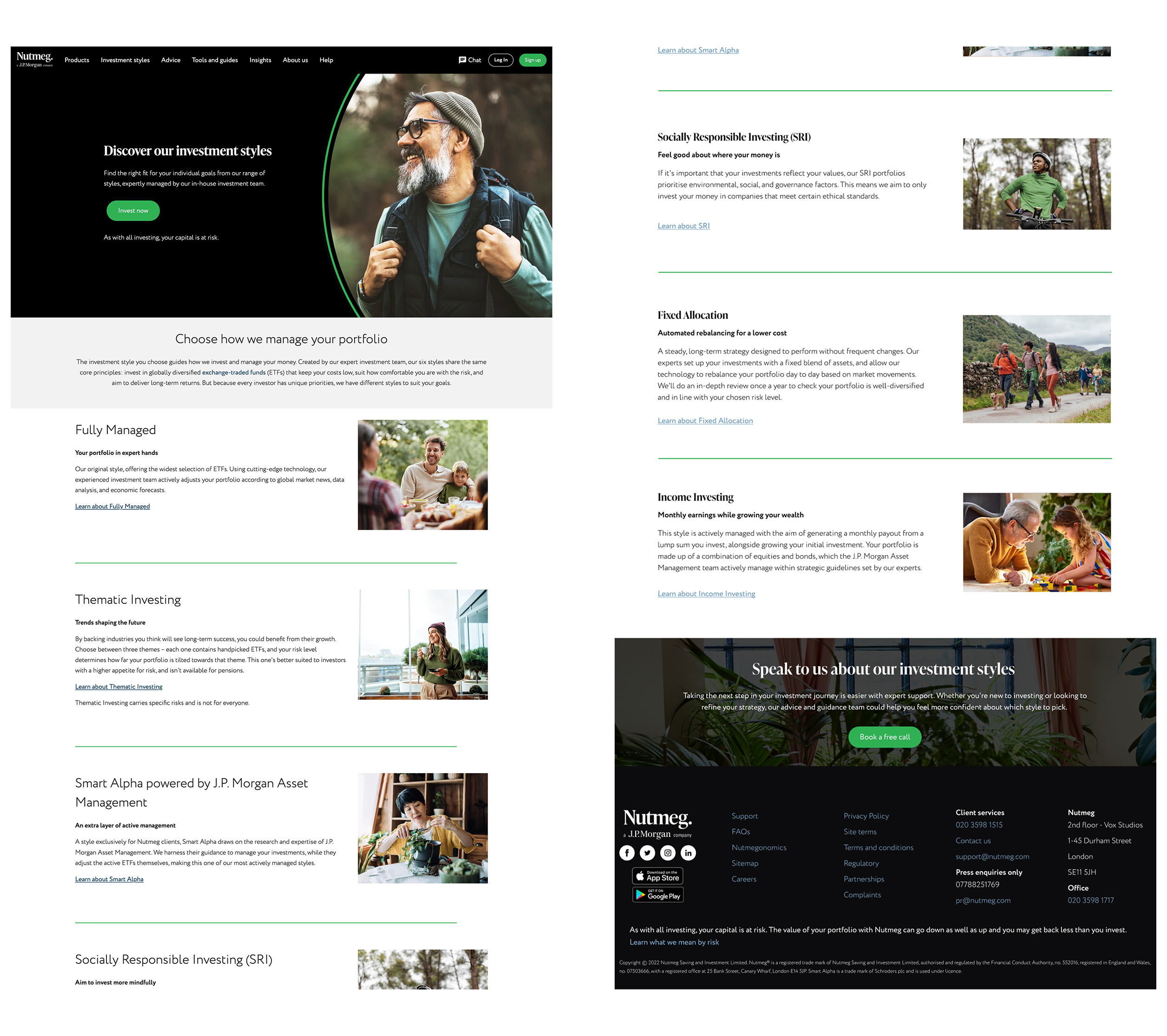
I designed a landing page to help users compare Nutmeg’s different investment styles (6 in total) in one place. Before this, each style had its own page, but there wasn’t a single page that gave a quick overview.
Goal
Make it easy for users to understand the differences between our investment styles at a glance, and help them decide where to go next.
DESIGN APPROACH
To keep things minimal and easy to digest, I:
Used a clean layout with soft green section dividers for visual separation.
Focused on clear, concise copy for each investment style
Added supporting imagery to make the page more engaging and approachable.
Included links to detailed product pages for deeper exploration.