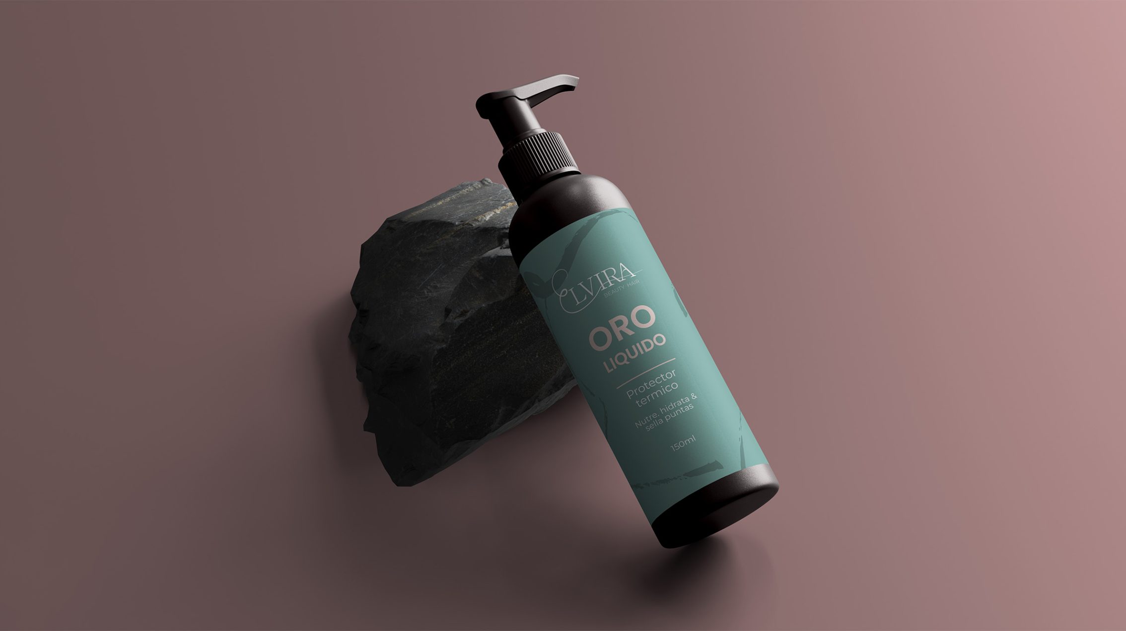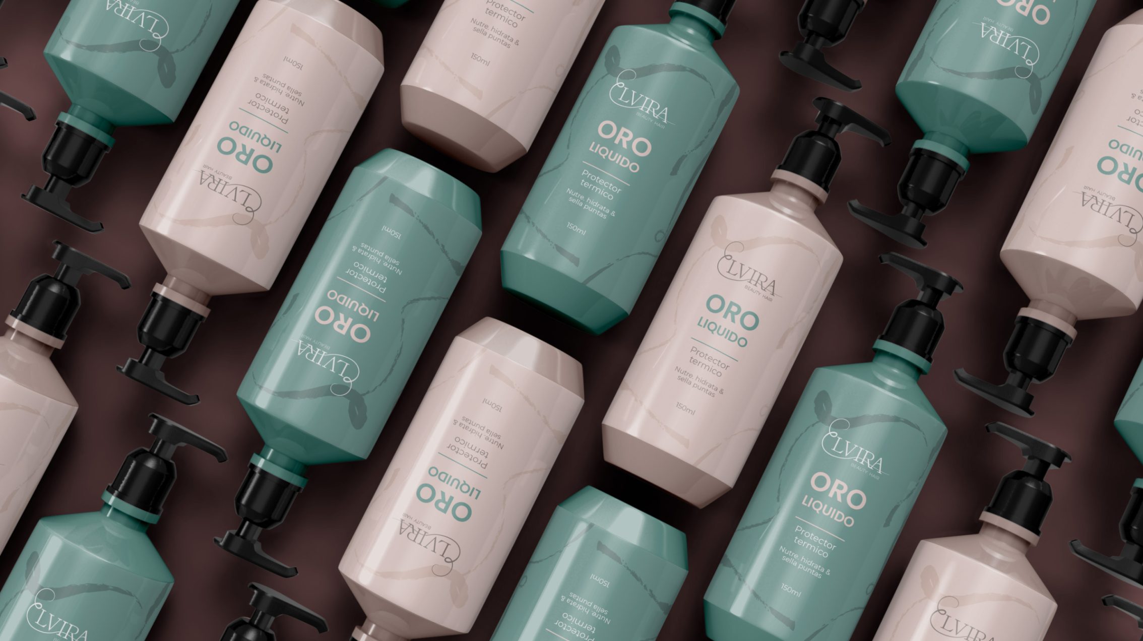
Elvira Beauty Hair
Brand Identity Design, Socials Templates & Illustrations
Elvira Beauty Hair is a business that specialises in hair care products and services.
One of the key services offered is a long-term hair straightening treatment. This treatment lasts for 3 to 4 months, meaning that after getting it done, you won’t need to use a hair straightener during that time. It makes hair maintenance much easier and saves you time in your daily routine. They also offer a variety of products to help maintain your treatment and keep your hair healthy, shiny, and looking its best.
Keywords: self care, clean, muted tones.
Primary logo
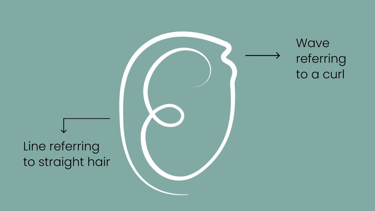
I wanted to emphasize the ‘E’ in the design, so I gave it a cursive style and shaped it to resemble a curl. As the ‘E’ extends into the rest of the brand name with a long, smooth tail, it represents the transformation of hair from curly to straight during the straightening service they offer. This flowing design not only illustrates the hair’s transition but also acts as an underline, guiding the eye smoothly across the entire brand name and making it easier for people to read and follow along.

Secondary logo


