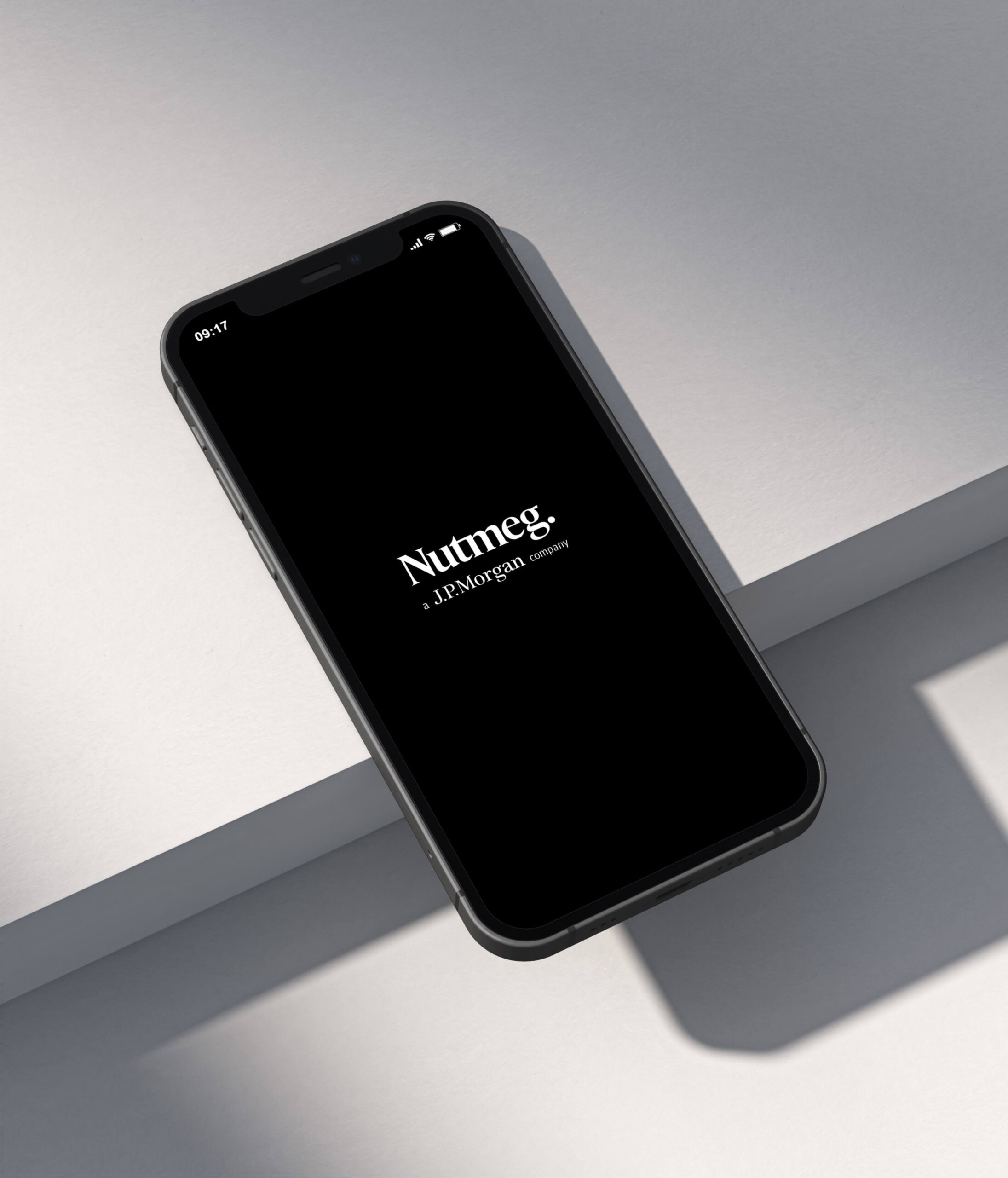
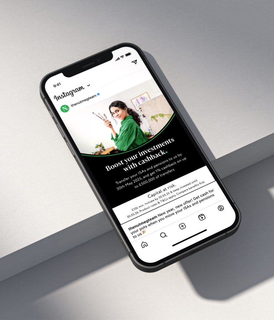
Nutmeg

Web Design, Animations, Illustrations, Templates

I’ve been part of three rebrands at Nutmeg all the way from 2019 till 2021 when we launch the last and current brand. In this page you will see some of the work I did over those years till the present and you will see how the brand evolved into a more sophisticated version.

2019

Collage, photoshop, pop art​

In 2019, Nutmeg’s visual identity used a lot of collage and textures, with a pop art feel that really stood out from other finance companies because of its boldness.

2020

Vector, Isometric

In 2020, we introduced vector graphics and perspective elements while retaining nutmeg green as the primary color. We also incorporated numerous animations across social media and added GIFs to email campaigns for a more dynamic experience.

2021

Clean, Geometrical shapes, Images, Animations

In 2021, the design adopt a cleaner, more minimalistic aesthetic, incorporating geometric shapes to enhance the overall look while maintaining the ability to create animations. I also developed a number of seamless carousels and designed websites using CMS platforms.

@2024 @florja.design

m

Nullam id dolor id nibh ultricies vehicula ut idelit aenean eu leo quam mesque ornare sem lacinimi quam.