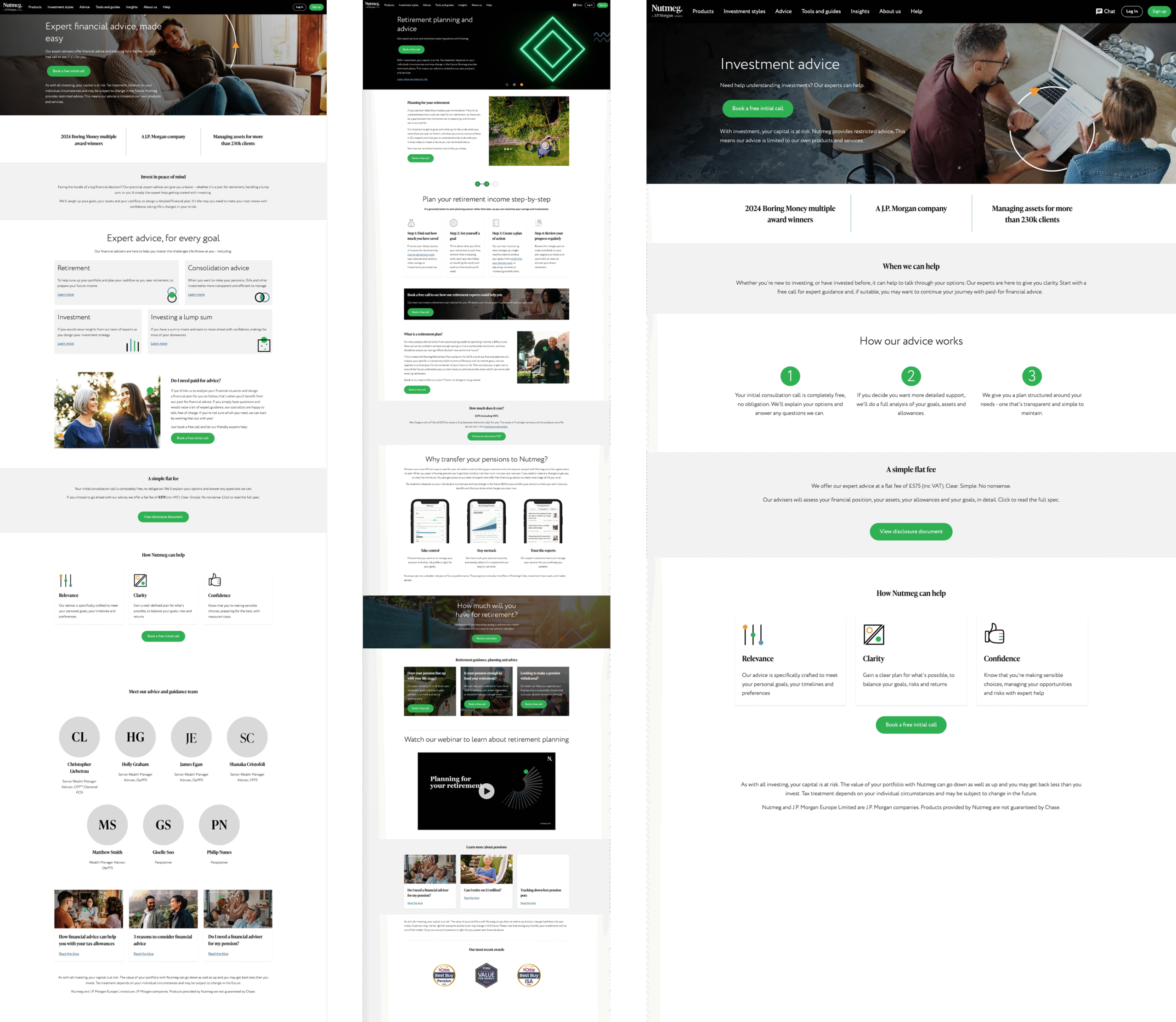
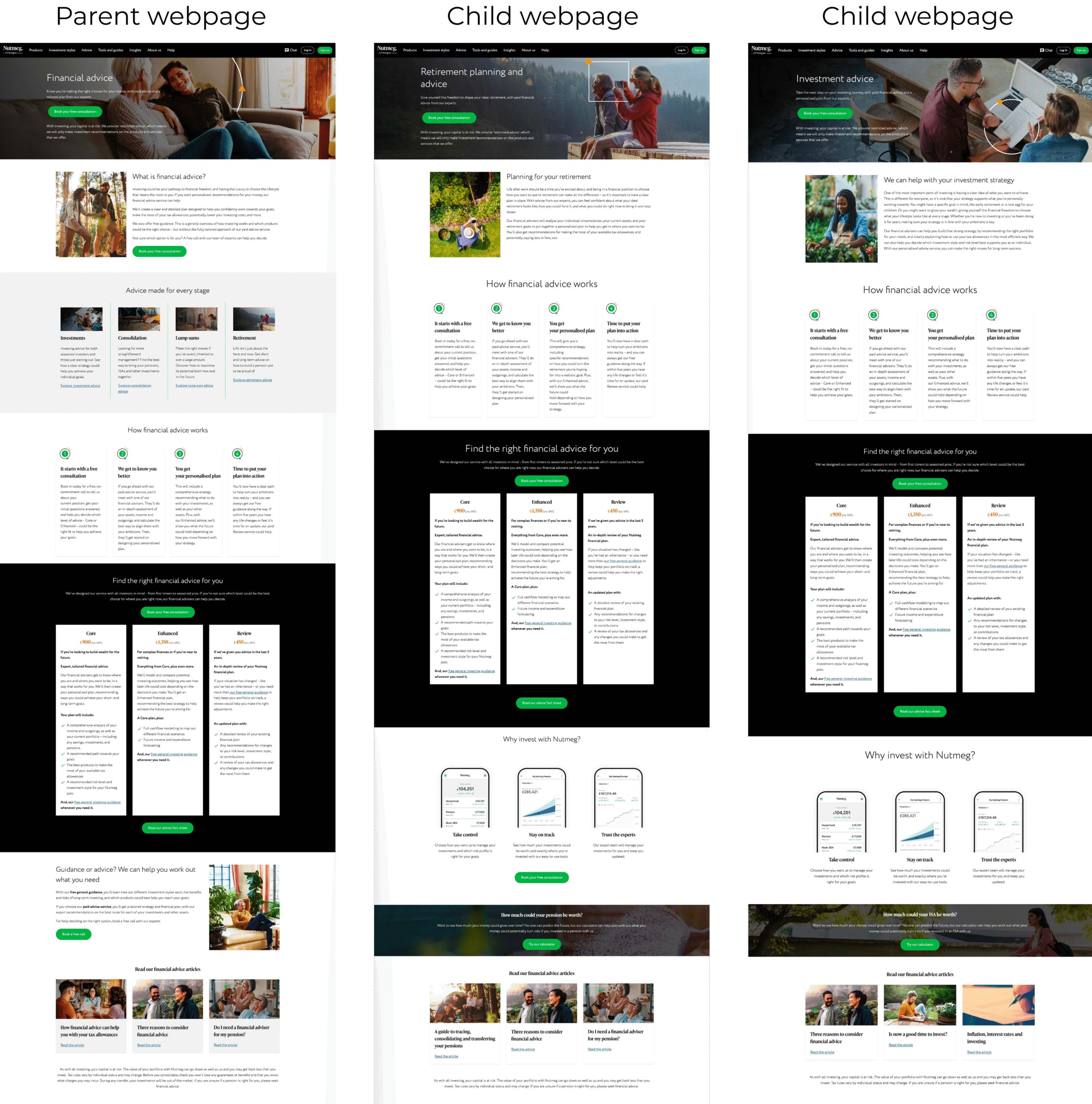
I redesigned a series of five advice service web pages to improve clarity, engagement, and conversion rates for booking free consultations.
The previous designs were cluttered, text-heavy, and required excessive scrolling to reach key content. Visual hierarchy was inconsistent, excessive amount of CTA’s which confused, and the overall experience had unfriendly language and discrepancies between pages which seemed they didn’t belong to the same group.
Goal
Create a clear, friendly, and accessible user experience that:
Makes it easy for customers to choose the right advice option.
Use friendly/accesible languange.
Encourages booking a free consultation to convert.
Introduces a new tiered pricing structure.
Maintains brand cohesion across multiple sites while allowing for content customisation.
DESIGN APPROACH
Declutter & structure: Reduced unnecessary content, introduced more white space, and reorganized information to minimize scrolling.
Streamlined CTAs: Reduced the number of call-to-action elements and made “Book a Free Consultation” the clear primary action, to improve conversion.
Pricing component: Reusing a component that we previously had and just adding an input for the price, I created a quick, successful solution that was a quick fix for the engineers and design, and met the deadlines.
Consistent template within the subpages: Designed a shared template for all 4 websites to unify the brand while supporting site-specific content.
Enhanced visual appeal: Incorporated imagery, varied backgrounds, and accents to create a more dynamic and engaging experience.